In the ever-evolving world of design, where trends come and go faster than you can say “Helvetica,” one element remains steadfast: typography. More specifically, structured typography, those bold, clear fonts that seem to whisper sweet nothing’s about stability plus organization.
In this blog post, we will explore how structured typography can create a sense of clarity in design, appealing to users’ innate desire for order amidst the chaos of modern life.
So grab your favourite beverage (preferably something caffeinated), settle into your most comfortable chair, and let’s dive deep into the world of structured typography.
>>>Related post: Top-Level Web Design: Kinetic Typography<<<
What is Structured Typography?
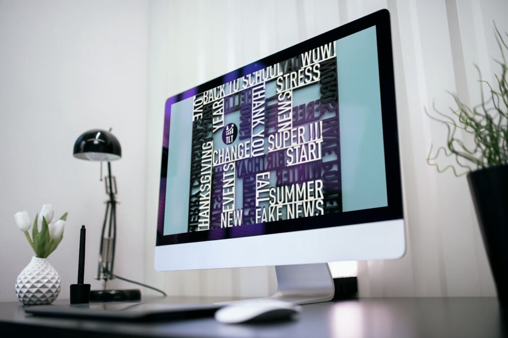
Structured typography refers to the use of fonts that are designed with clarity and organization in mind.
These fonts often feature clean lines, consistent spacing, and a balanced structure that makes them easy to read and aesthetically pleasing.
Think of it as the architectural blueprint of your text, solid, reliable, and built to last.
The Importance of Typography in Design
Typography is not just about choosing a pretty font; it’s about communication.
The right typeface can convey emotions, set the tone for your message, and even influence user behaviour.
According to typographic principles established by experts like Ellen Lupton in her book Thinking with Type, typography is an essential part of visual communication that shapes our understanding of content.
When we talk about structured typography specifically, we’re referring to fonts that provide a sense of stability.
This stability is crucial in today’s fast-paced digital environment, where users are bombarded with information from all directions. A well-structured typeface can act as an anchor amidst this storm.
The Psychology Behind Structured Typography
Stability and Clarity
Have you ever noticed how certain fonts make you feel more at ease?
It’s not just your imagination; there’s psychology at play here.
Research suggests that people are drawn to organized structures because they provide comfort and predictability (Lupton).
When users encounter bold and structured fonts, they subconsciously associate them with reliability and professionalism.
For instance, consider the difference between a chaotic script font versus a clean sans-serif typeface like Arial or Helvetica.
The latter offers clarity, a beacon guiding users through the foggy waters of information overload.
User Experience (UX) Considerations
In UX design, every detail counts, from colour schemes to button placements, typography is no exception.
A study published in The International Journal of Human-Computer Studies found that legible typefaces significantly improve user experience by reducing cognitive load (Dillon).
When users can easily read text without straining their eyes or deciphering convoluted letters, they are more likely to engage with content meaningfully.
Choosing the Right Fonts for Structured Typography
Characteristics of Bold Fonts
When selecting fonts for structured typography, look for characteristics such as:
-
- Legibility: Ensure that each letter is distinct from others.
-
- Weight: Boldness should be used strategically; too much weight can overwhelm.
-
- Spacing: Adequate kerning (spacing between letters) enhances readability.
-
- Alignment: Consistent alignment creates harmony within your design.
Some popular top-level examples include:
-
- Helvetica: A classic choice known for its neutrality.
-
- Futura: Offers geometric shapes that evoke modernity.
-
- Roboto: A versatile sans-serif font designed for digital interfaces.
Combining Fonts Effectively
While bold fonts are essential for creating structure, combining them effectively with other typefaces can elevate your design further.
Some popular top-level examples include:
-
- Pairing a bold header font like Montserrat with a lighter body font like Open Sans creates contrast while maintaining readability.
-
- Using serif fonts for headings (like Times New Roman) alongside sans-serif body text (like Arial) can create an engaging visual hierarchy.
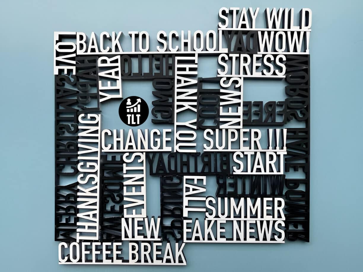
Implementing Structured Typography in Design Projects
Web Design Applications
In web design, structured typography plays a pivotal role in enhancing user experience:
-
- Hierarchy: Use different font sizes and weights to establish visual hierarchy on web pages.
-
- Consistency: Maintain consistent typographic styles across all pages to reinforce brand identity.
-
- Responsive Design: Ensure that your chosen fonts remain legible across various devices, because nobody wants to squint at their phone screen!
Example Case Study: Airbnb
Airbnb’s website employs structured typography effectively by using bold headers paired with lighter body text throughout its interface.
This approach not only enhances readability but also guides users seamlessly through their booking process.
Print Design Applications
Structured typography isn’t limited to digital realms; it thrives in print as well! Whether designing brochures or business cards:
-
- Contrast: Use contrasting weights between headings and body text for emphasis.
-
- Alignment: Keep elements aligned consistently, nothing screams “amateur” like misaligned text!
-
- Whitespace: Don’t underestimate whitespace; it allows your content room to breathe!
Example Case Study: National Geographic Magazine
National Geographic magazine utilizes structured typography masterfully by employing bold headlines against striking imagery while ensuring body text remains legible even at smaller sizes, a perfect marriage between form along with function!
The Future of Structured Typography
As technology advances, think variable fonts, the possibilities for structured typography expand exponentially!
Designers now have access to dynamic typefaces that adjust weight or width based on user interaction or screen size, talk about futuristic!
However, while embracing innovation is vital in any creative field, it’s equally important not to lose sight of fundamental principles rooted in clarity & organization which have stood the test of time!
Conclusion
Structured typography serves as both an art form & functional tool within design disciplines, from web interfaces down to printed materials, it provides stability amidst chaos while appealing directly towards human desires for orderliness!
By comprehending structured typography, its psychological impact & implementing our top-level practices when choosing appropriate typefaces, we empower ourselves to create designs to resonate deeply to audiences everywhere!
Eric Luis – CEO – Top Level Traffic
So next time you find yourself scrolling through endless content online or flipping through magazines, take a moment to appreciate the beauty behind thoughtfully crafted words, they’re more than just letters, they’re bridges connecting us ideas emotions experiences!
>>>Related post: Top-Level Web Design: Kinetic Typography<<<
If you found this post, “Top-Level Web Design: Kinetic Typography” helpful or interesting, please feel free to give it a share or like it, so others may find value in this post.
We will be happy to advise you along with answer any questions you may have.
Be it with Manual Social Media Management from our team of experts, at a lower cost plus at a higher level of quality than any automation tools.
Or maybe you just require some professional website design or branding? We have you covered.
Book your FREE no-obligation quote today!
Our normal service area is Bridgend, however, we also cover Swansea, Port Talbot, Bryncethin, Sarn, Ogmore Vale, Maesteg, Llantwit Major, Cowbridge, Barry, Penarth, Dinas Powys plus Cardiff.
We can also offer worldwide remote support, with competitive rates plus a friendly, professional service. We are always here to help 24/7.
Or simply start a live chat in the bottom right of this page to say hello 🙂
To our continued health plus success,
Eric Luis – CEO Top Level Traffic – Web Design Bridgend.